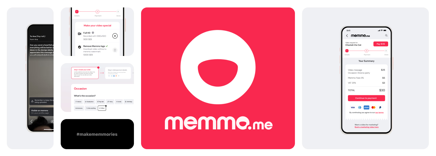
Memmo: Platform Redesign & B2B Integration
Repositioning Memmo to capture the high-ticket B2B market and increase Average Order Value, without alienating the core consumer base.
01. Background
Platform Value & Background
Memmo is a two-sided marketplace that removes traditional gatekeepers, connecting everyday fans and enterprise brands directly with global talent and celebrities for custom digital services.
The Strategic Shift
As organic corporate demand surged, Memmo’s legacy B2C infrastructure created massive friction for high-ticket buyers. The redesign was a critical business mandate to build a scalable, dual-pathway system that captured lucrative enterprise revenue without disrupting the core consumer experience.
02. Problem Overview
The Challenge
A confusing design and high error rates were actively turning away high-paying corporate clients before they even reached the cart.
A rigid legacy architecture stifled scalability and drove significant revenue loss. Analytics revealed a critical premature churn issue where users consistently abandoned the flow entirely before reaching the checkout stage.
Core Usability Issues
High Error Rates
Failing to separate user types drove a high volume of cross-segment order mistakes, such as placing B2C orders for B2B needs.
Poor Information Architecture
A cluttered visual hierarchy and illogical CTA placement introduced heavy friction into the core workflow.
Weak Value Proposition
The interface failed to communicate product quality or brand value, leaving buyers confused about what they were actually purchasing.
The Objective
To completely overhaul the core user experience, introduce a highly flexible and scalable design system, and create a frictionless checkout flow that reduces premature churn and eliminates order-type errors.
Of users located the B2B portal in under 3 seconds post-launch, up from 0% in baseline testing
Drop-off rate on individual talent profile pages
Misclassified B2B/B2C orders at checkout
Explore the Full Flow
The redesigned page in full, scroll through it below exactly as a visitor would, from the new hero down through trust signals, talent categories, and the contact form.

03. The Design Process & Execution
Competitive Analysis
To position Memmo effectively, we first conducted a deep dive into the competitive landscape. By identifying critical market gaps, we interpolated the few successful features from top-performing competitors (based on a SWOT analysis) and integrated them into our initial concepts.
Discovery & Usability Testing
While our quantitative analytics clearly mapped out what was happening, high churn and order-type errors, we needed qualitative data to understand why. To uncover the root causes, I facilitated five moderated usability sessions.
During these sessions, I walked testers through a deliberate sequence to gauge their reactions and pain points:
User Feedback
The usability sessions revealed specific friction points regarding layout, perceived value, and competitor advantages:
Synthesis & Core Takeaways
Synthesizing the data from all five usability sessions revealed distinct patterns in user behavior and clear areas where the platform’s architecture was failing. The sessions converged on four critical themes:
Iterative Design & Stakeholder Alignment
Armed with these insights, the project shifted into a continuous, agile feedback loop:
MVP Sign-off & Developer Handoff
Through this rigorous loop between user feedback and team collaboration, we landed on a final design that balanced user needs with business goals. Once we achieved full stakeholder alignment and MVP sign-off, I transitioned into a support role, working closely with the development team to ensure a seamless, pixel-perfect implementation of the final product.
04. Outcome & Retrospective
Once the redesign shipped, I pulled post-launch data to check whether the specific decisions above actually landed, not just whether the page "felt" better.


Improved engagement (Click rate) in the new version vs the legacy
What I Learned
Not every finding pointed the same direction, and I don't think that's a failure of the research, it's what real research looks like. One tester found the new page's use-case categories clarifying; another found the page "quite long" with "too many categories" once we'd finished adding all of them. Both were right. The honest resolution wasn't a single design that satisfied everyone, it was accepting that structure and depth trade off against each other, and choosing structure deliberately because the checkout confusion it fixed was the more expensive problem. B2B design isn't about making the page feel exciting , it's about making a specific, occasionally boring decision easy to defend to someone else's boss.