
From a Static Dashboard to the Engine Behind Every Enterprise Demo
How I turned a static landing screen into a modular widget platform, lifting CSAT from 2.7 to 3.9, cutting time-to-action by 45%, and making the dashboard Quinyx’s #1 sales feature.

The Problem
Instead of acting as a daily command center, the poorly designed dashboard buried critical KPIs, forcing managers to make complex workforce decisions entirely in the dark.
Quinyx is a workforce management platform built for businesses that run on shifts, retail, hospitality, healthcare, and other high-volume, frontline industries. It brings scheduling, forecasting, time & attendance, and team communication into one system, so managers can staff accurately and employees get clearer, fairer schedules.
Despite serving global enterprise clients like Ryder and Rituals, the Quinyx platform suffered from a generic landing dashboard that offered a one-size-fits-all experience. This lack of relevance drove a 2.7/5 CSAT score, turning a core product surface into a massive churn risk and a blocker for high-value sales demos.
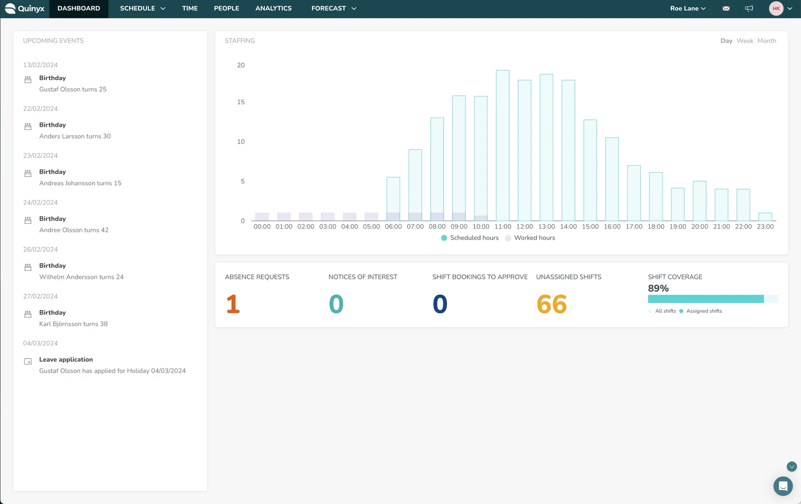
The legacy Quinyx dashboard
Validating the Architectural Trade-offs
The redesign achieved significant traction shortly after release, changing the nature of how Quinyx was sold to enterprise clients.
Customer survey, May 2025 vs. May 2026
Reduction for local shift managers
Shifted from a product liability to demo highlight
Separating UI testing from framework validation allowed for precise failure diagnosis. By validating widget utility and system logic independently, it became instantly clear if a problem was a localized design issue or a broader structural error.
The Solution
An empathetic, role-aware design bridges the gap between complex data and daily tasks by seamlessly guiding users from discovering an underlying issue to resolving it.
Instead of a rigid layout, a configurable container allows product teams to surface relevant metrics without overwhelming the user. The resulting experience filters out UI noise and directs focus entirely on actionable daily priorities.
1. Modular Architecture
Instead of a generic grid, I designed a scalable widget system driven by role-based intelligent defaults. The system adapts its layout based on the logged-in persona.
2. Contextual Personalization
When a regional director logs in, the dashboard automatically surfaces overarching forecasting trends. Conversely, when a local store manager logs in, the view instantly shifts to immediate absence metrics and daily staff coverage.
3. Self-Serve Customization
The system empowers users to effortlessly build, customize, and save their own specific data stories using an intuitive drag-and-drop interface, without requiring any engineering or IT support.
A Dashboard Driven by User Experience
If we wanted the new Quinyx dashboard to deliver true efficiency and adoption, we had to rethink our design process. We prioritized establishing a core set of design principles, ensuring they were embedded in every level of the product experience.
In the end, four core principles were adopted as mantras: Instant Clarity, Anticipatory Design, Actionable Insights, and Frictionless Execution.
Using these principles as our foundation, we created a comprehensive UX framework to guide development, termed the ‘Quinyx Flow’, and shared the new dashboard strategy during the Quinyx Innovation Day 2024, showcasing it to key clients and global teams.
Instant Clarity
Our goal is clarity over complexity. Strip away non-essential elements and clutter. Every component must serve a singular, clear purpose, facilitating a smooth, intuitive user journey without distraction.
Anticipatory Design
Instead of waiting for user input, the system predicts the need. We leverage intelligent data to surface the right tools and actions at the exact moment of need, transforming the dashboard from a reactive tool into a proactive partner.
Actionable Insights
Empower swift decision-making by surfacing the most critical next step. The user should instantly understand their priority. Our interface should prioritize key actions and critical information to enable users to complete their tasks efficiently.
Frictionless Execution
Time is the most valuable asset in workforce management. We meticulously map and eliminate dead ends, redundant clicks, and visual noise, creating an uninterrupted flow from the user’s initial intent to task completion.
Uncovering the True Jobs-To-Be-Done
We ran structured JTBD discovery across enterprise customers (Ryder, SATS, Coor, Rituals, KRY and more) spanning retail, logistics, hospitality, and healthcare.
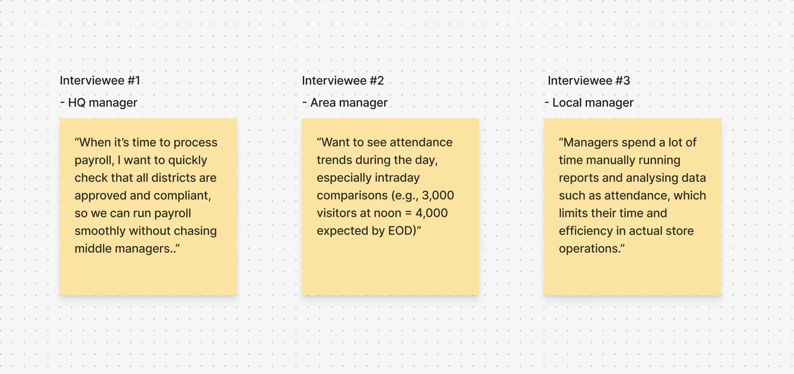
User needs were starkly polarized between localized tactical triage for frontline managers and high-level pattern recognition for regional leaders.
Framing the Opportunity
With the research synthesized, I translated the insights into a set of How Might We questions, then stress-tested each one against a concrete assumption before committing to a direction.
HMW Questions & Key Assumptions
| How Might We (HMW) Question | Key Assumption |
|---|---|
| HMW surface the most critical issues first so managers can instantly see what requires attention (e.g., compliance alerts, missed punches, overtime risks)? | Managers care more about severity and impact than raw counts of issues. |
| HMW help managers understand the root cause of each warning (e.g., is the overtime due to understaffing, or poor forecasting)? | Managers prefer to resolve issues directly from the dashboard instead of navigating to other tabs. |
| HMW reduce alert fatigue by grouping, prioritizing, or filtering warnings by urgency, impact, or category (e.g., compliance vs. absence)? | HQ, district, and local managers need different views/filters, not one shared list. |
| HMW make warnings actionable directly from the dashboard (approve absence, fix punch, send reminder, adjust schedule)? | Too many alerts cause fatigue; grouping or collapsing low-impact ones improves usability. |
| HMW personalize the warnings by role and responsibility (HQ sees budget/compliance, local sees attendance/coverage)? | Managers want to see not just today’s issues but emerging patterns. |
| HMW show trends or recurring issues (e.g., repeated missed breaks or chronic absenteeism) to support prevention, not just reaction? | Warnings without context (who, where, when, impact) are ignored. |
| HMW integrate the Dashboard into daily workflows so it becomes a “command center,” not just an alert board (e.g., quick links, approvals, summaries)? | Quick links to related actions (e.g., approve absence, open schedule) increase adoption. |
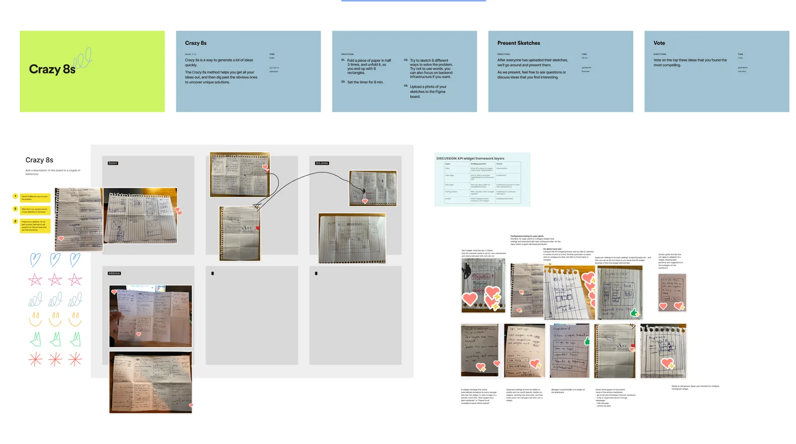
The Crazy 8s ideation session where the team sketched divergent directions before converging on the widget framework.
What I Learned
The instinct with a dashboard is always to add, one more widget, one more metric. The hardest and most valuable calls here were architectural: deciding what belonged in separate widgets versus what should be merged, which metrics should auto-surface versus stay hidden, and how much control to give end-users without turning the dashboard into a settings page.
Next Steps
With another month, the priority would be scaling the platform globally so any Quinyx product team can build on it, retiring the last legacy widgets, and adding the forecasting and compliance layers identified during discovery.